Have you ever heard of contrast in art? You probably have no idea what that is. So you are wanting to know what contrast in art is and what types there are. Today, we are going to take a look at contrast and see what it really means.
What Is Contrast In Art?
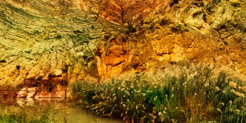
As it pertains to art, contrast takes place when opposite elements are arranged together. You may have seen a piece of art that puts you in the mind of an illusion. Well, this is a contrast of colors and it is a very popular art element.
Is Contrast a Popular Art Element?
Yes, contrast in a way is a popular art element. One of the most important art elements is color and contrast has a lot to do with colors and contrast also has something to do with lines and shapes. Contrast is a principle in art with many aspects.
Contrast in art is very important even more than you probably know. Artists use contrast to create masterpieces all of the time. It would practically be impossible to develop a great art piece without considering contrast.
Contrast in art is one of the major art principles so I’m sure you can understand just how important it is. Many people consider contrast in art to be the golden rule for creation. This is because contrast plays such a big role in bringing a painting together and making sure it looks right.
When painting, colors, lines, shapes and everything else has to be cohesive. These things must all go together to create a beautiful outcome. This can only be done with the use of contrast in art.
What Is An Example of Color Contrast Art?
There are so many examples of color contrast art. One example of this would have to be colors that are the opposite of one another. A black and white picture or painting shows the contrast in art because black is the opposite of white and therefore this shows a contrast.
Colors that are opposite each other on the color wheel have the highest contrast possible. A painting with the colors red and green shows contrast in art because these two colors are completely opposite each other on the color wheel.
There are some colors that are low contrast when it comes to art. For example, red-orange and orange are low contrast because they are right next to each other on the color wheel. As you can see, the color wheel plays a very important part in contrasting art
So basically, examples of contrast in art are limitless and can mean anything that is a direct opposite of one another. Another example of how contrast is used in the real world is that people with dyslexia read faster with lower contrasts but they prefer higher and brighter contrast pairs.
Look around you and you will find all sorts of contrast examples.
Is Contrast In Art Hard to Understand?
Yes, it can be and in fact, it was hard for me to understand. Contrast in art can be very hard to understand, especially if you do not know much or anything about art. To artists, contrast comes naturally and they couldn’t see life without it, literally.
Understanding art principles and concepts can be a daunting task. However, with some training and education, contrast in art doesn’t have to be a foreign thing to you. Just like with any other art principle contrast can be learned.
How Do You Create Contrast in a Painting?
You have a number of different ways to create contrast in a painting. A lot of artists have contrast paintings in their portfolio. Because we know that contrast involves opposites, this is one great way to create contrast in a painting.
Red and green are opposite on the contrast wheel and this can be used in a painting. Trees and rose bushes are one example of a contrast painting. The colors green and red are being incorporated into the painting.
The other way to create contrast in painting is to use the colors black and white to create a sort of an illusion. The two colors come together to create some funky things. Not to mention the illusions and other designs you can create when you throw in different shapes with the black and white colors.
Because we are talking about opposites. The shapes that you use should be made to go in opposite directions, thus creating even more of an illusion. Contrast can be easy to incorporate in art because there are so many different things that make up contrast.
Why Is Contrast So Important in Art?
Contrast is important in art for a number of reasons. One reason contrast is so important is because it is nearly impossible to create a good painting or portrait without contrast. To an artist, contrast is like the golden rule of creation as was mentioned before.
Contrast is important because it can help an artist create a masterpiece. Contrast can be used for so many things in art. It can be used to tell a story just through colors, lines, and shapes.
The way a portrait is laid out can tell a story about anything and that is a really cool aspect of contrast. It can help to create a better composition. Contrast can even be used to draw attention to a certain focal point.
If you have ever seen a portrait that incorporates contrast really well and has a focal point you may have keyed right in on that focal point and that is the purpose that the artist was going for.
The story that contrast tells can be really important. It can shed light onto what the artist was thinking when creating this painting. He may have felt uneasy about a situation.
What Are the Types of Contrast in Art?
There are all types of contrast in art. Some of which we have already touched on. One of the main types of contrast is color contrast. This is when opposite colors as well as high contrast and low contrast colors are used to convey a certain message or feeling.
Texture contrast is another type of contrast. If you’ve ever seen a piece of paper that feels a certain way and it feels different from regular paper this means it has a different texture contrast. Another type of contrast is size contrast. Of course it has something to do with the size of the objects that are in the painting.
There may be really small objects and really large objects to bring attention to these things as a focal point of a painting. Temperature contrast, space contrast, and edge contrast are just three more kinds of contrast that you can use in art and incorporate into paintings of any kind. There are so many different contrasts.
What Is Contrast In Art?
Contrast in art is basically the principle of opposite objects or colors. The opposite in shapes can be the opposite of a circle is a rectangle. Basically, these two objects are very much different. With colors, black and white are complete opposites on the color wheel and this is contrast.
The Importance of Contrast in Art Compositions
Contrast in art compositions is a highly important aspect that can greatly enhance the visual appeal and engagement of a viewer.
By juxtaposing different elements such as color texture size and shape artists can create stunning compositions that grab attention and communicate their intended message.
One valuable technique is the use of complementary color combinations where colors that are opposite each other on the color wheel are used to create a contrasting effect and make the image pop.
Another effective method is contrasting sizes using elements of different sizes to create depth and add visual variety.
By intentionally creating contrast in their artwork artists can reinforce a theme evoke specific emotions and tell a powerful story through visual means.
Understanding the diverse ways in which contrast can be achieved is essential for artists to master composition and create impactful artworks.